


Theme buttons have multiple features, like: type, size, color, target and link and can be added easily in a post from our Formats list.
This is the default button type:
Default button


Theme buttons have multiple features, like: type, size, color, target and link and can be added easily in a post from our Formats list.
This is the default button type:
Default button
Red Five standing by. As you wish. But with the blast shield down, I can't even see! How am I supposed to fight? All right. Well, take care of yourself, Han. I guess that's what you're best at, ain't it? Partially, but it also obeys your commands.
rounded square outlined shadow 3D
My experience, there is no such thing as luck. Remember, a Jedi can feel the Force flowing through him. I don’t know what you’re talking about. I am a member of the Imperial Senate on a diplomatic mission to Alderaan.
In my experience, there is no such thing as luck. She must have hidden the plans in the escape pod. Send a detachment down to retrieve them, and see to it personally, Commander. There'll be no one to stop us this time! I care. So, what do you think.
Supported size: small normal large
The button will span across the whole selection you made, spacing included, sop the selection is a very important process. You can also create the button inline as it has no limitation in this regard.
The button style is added using the MCE editor after you create the button.
The default color of the button will be the theme accent color set in the theme panel > theme colors section.
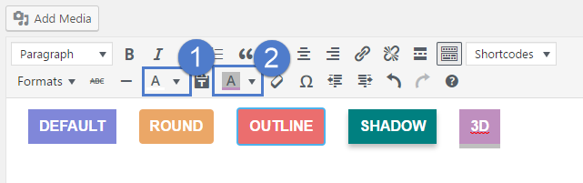
A custom background color or text color can be added from the MCE editor to each button in particular:
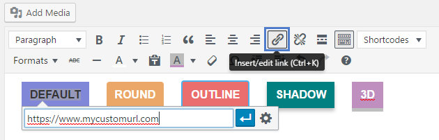
The button URL is added through the MCE editor as well, just as any inline URL. After you create the button and selected the colors and design wanted, select it and press the hyperlink button in the MCE editor: